前言
UI组件的一个很重要的功能,就是允许可以定制化主题。 而且这也是为啥写组件的时候,要把对应组件的 scss 样式抽出来,不让其打包到 air-ui.common.js 的原因,这个原因就跟语言包为啥也要抽出来,不打包进去的原因。因为这样会增加 air-ui.common.js 的体积,而且我们要使用定制化主题的话,或者使用其他语种的,原有的打进去的默认主题和默认语种,就都没有用了。 所以这也是为啥当我们引入 air-ui.common.js 的时候,也要同时引用 css 文件的原因,因为 air-ui.common.js 并没有包含样式。
var.scss
为了更好的提供组件主题定制,我们规定所有可定制化的参数,全部写在 var.scss, 也就是说,假设我新做了一个组件,叫 dropdown, 并且我希望他有几个样式可以被定制化,那么就可以把参数写在 var.scss 文件里面 (这个文件不涉及到具体的 class 样式,全部都是参数), 那么就可以在这个文件加上以下参数:1
2
3$--dropdown-menu-box-shadow: xxx !default;
$--dropdown-menuItem-hover-fill: xxx !default;
$--dropdown-menuItem-hover-color: xxx !default;
然后参数定义好了。就可以在 dropdown.scss 中, import 这个文件,然后引用这些参数:1
2
3
4
5
6
7
8
9
10
11
12@import "common/var";
@include b(dropdown-menu) {
position: absolute;
top: 0;
left: 0;
z-index: 10;
padding: 10px 0;
margin: 5px 0;
background-color: $--color-white;
border: 1px solid $--border-color-lighter;
border-radius: $--border-radius-base;
box-shadow: $--dropdown-menu-box-shadow;
这样子,我后面如果想改这些参数的值,只需要在 var.scss 文件修改对应的参数值,然后重新打包即可。
所以定制化主题的原理,其实就是重写 var.scss 文件,然后重新打包对应的 css 文件。
element ui 的实现
通过拉取 element-ui 的项目源码,我们知道他有一个页面可以实现主题定制:
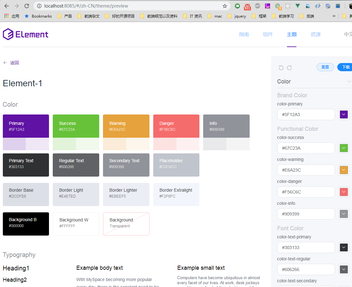
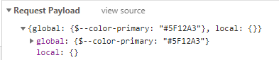
原理就是通过修改 var.scss 里面的配置,来重新拉取新的样式从而覆盖:1
curl "https://element-api.ele.me/element/theme/updateVariable?version=2.12.0" -H "Sec-Fetch-Mode: cors" -H "Referer: http://localhost:8085/" -H "Origin: http://localhost:8085" -H "User-Agent: Mozilla/5.0 (Windows NT 6.1; Win64; x64) AppleWebKit/537.36 (KHTML, like Gecko) Chrome/77.0.3865.75 Safari/537.36" -H "Content-Type: application/json" --data-binary "^{^\^"global^\^":^{^\^"^$--color-primary^\^":^\^"^#5F12A3^\^"^},^\^"local^\^":^{^}^}" --compressed
参数就是你修改的参数:
然后通过这个接口返回一个新的样式:
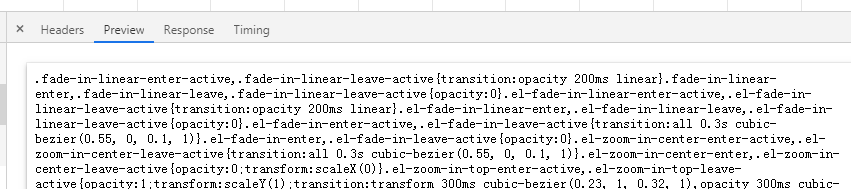
然后再将这个样式覆盖现有的样式,就可以看到界面的变化了。如果点击右上角的下载的话,也会去请求这个接口,然后会变成 download 的方式:1
curl "https://element-api.ele.me/element/theme/updateVariable?version=2.12.0" -H "Sec-Fetch-Mode: cors" -H "Referer: http://localhost:8085/" -H "Origin: http://localhost:8085" -H "User-Agent: Mozilla/5.0 (Windows NT 6.1; Win64; x64) AppleWebKit/537.36 (KHTML, like Gecko) Chrome/77.0.3865.75 Safari/537.36" -H "Content-Type: application/json" --data-binary "^{^\^"global^\^":^{^\^"^$--color-primary^\^":^\^"^#5F12A3^\^"^},^\^"local^\^":^{^},^\^"download^\^":true^}" --compressed
而且这时候,有加了一个参数:
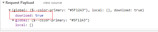
多了一个 download 为 true, 所以返回的时候,content-type 就变成 zip 包的形式了:
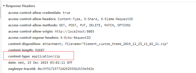
这样子就把这个自定义的主题下载下来了。 也挺方便的。 解压之后,发现就只有一个重新定义的 index.css:
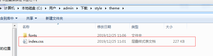
这个就是新的主题样式文件。因为这个接口是另外一个 element 的服务端项目,我们是没有代码的,他的作用就是通过要调整的参数,重新生成一份 css 文件返回给前端。我们看一下前端代码, 通过这个方法去请求后端数据:1
2
3export const updateVars = (data, cb) => {
return post(`${host}updateVariable?version=${version}`, data, cb);
};
调用代码在这边:1
2
3
4
5
6
7
8
9
10
11
12
13
14onAction() {
this.triggertProgressBar(true);
const time = +new Date();
updateVars(this.userConfig)
.then(res => {
this.applyStyle(res, time);
})
.catch(err => {
this.onError(err);
})
.then(() => {
this.triggertProgressBar(false);
});
},
res 就是后端返回的样式代码,然后通过 applyStyle 将新的样式代码覆盖。 同时通过 this.triggertProgressBar(false) 来显示进度。1
2
3
4
5
6
7applyStyle(res, time) {
if (time < this.lastApply) return;
this.updateDocs(() => {
updateDomHeadStyle('chalk-style', res);
});
this.lastApply = time;
},
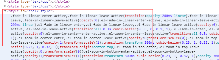
通过这个方法动态插入这个css 样式, 进行样式覆盖:1
2
3
4
5
6
7
8
9export const updateDomHeadStyle = (id, styleContent) => {
let styleTag = document.getElementById(id);
if (!styleTag) {
styleTag = document.createElement('style');
styleTag.setAttribute('id', id);
document.head.appendChild(styleTag);
}
styleTag.innerText = styleContent.replace(/@font-face{[^}]+}/, '');
};
通过查看控制台,可以看到:
这样子整个界面就变了。 可以看到,element-ui 的实现的主题定制还是挺详细的,但是还是有几点不足:
- 整个界面的逻辑代码太复杂了,每个项都能定制。他这个不适合我们这个内部组件的方式,为了实现这个定制过程,我得实现一个前端的手动操作的定制过程,性价比太低了。
- 他每次生成之后的 css 文件,只有根文件
index.css, 其他组件单独的文件其实并没有,也就是我没办法单独定制一个属于我自己的 button 组件的主题。如果要的话,我只能全部引入。 - 因为每次只能下载下来,一旦我后面更新了版本增加了新的组件,那边我还想要这个组件,我还得再下载一次,这样子新加的组件才能适用于这个主题。
air-ui 的做法
air-ui 的做法会非常简单,不需要那么多东西,既然知道了其实新的主题只是去重写了 var.scss 的某些参数属性,那么我们要调试出我们想要的主题,其实很简单。
在开发阶段,我们只需要在 var.scss 进行一些参数的调整,比如我调整了这两个属性:1
2$--color-primary: #7ca37a !default;
$--color-danger: #d009f5 !default;
因为我们是在本地测试环境进行的,所以也不需要重新刷新,直接热更新就可以看到效果了。
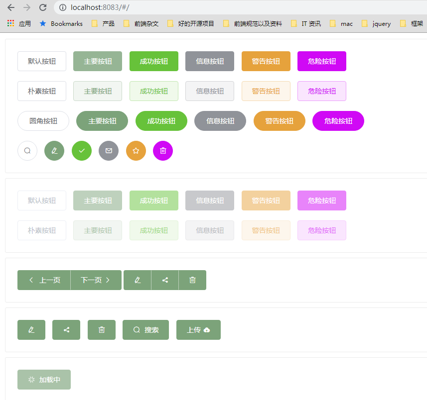
因为这个页面(home.vue)有全部组件的 demo,所以 var.scss 只要有调整,所有组件的 demo 有涉及到的,全部都会重新编译并且渲染。 (跟 element 那个自定义主题的操作页面的左边的所有的组件展示是一样的,甚至更加全面,因为所有的 demo 都可以看到变化)。
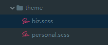
假设我们通过调整 var.scss 的多个参数,已经达到了我们想要的主题的效果了。接下来怎么把这个主题进行保存呢,肯定是不能直接提交 var.scss 文件的,因为这样子相当于原有的默认主题就被改变了。 所以我们的做法是在 src 目录下创建一个 theme 用来存放你想要的主题。
假设我通过调整 var.scss 得到两个主题,一个是用于个人版的,一个是用于企业版的,那么我就创建两个文件,命名分别是 biz.scss 和 personal.scss, 名字就是后面的主题名哦:
然后里面的内容,其实就是这些主题跟 var.scss 这个默认主题不一样的配置,也就是你刚才调整的那些变化的参数,就写在这里面,因为这些是要打包的时候覆盖 var.scss, 所以只需要将有变化的摘出来就行了。比如 biz.scss 这个文件的内容是这样子的:1
2
3$--color-primary: #7ca37a !default;
$--color-danger: #d009f5 !default;
$--border-radius-base: 8px !default;
presonal.scss 的内容是这样子的:1
2
3$--color-primary: #18a0a3 !default;
$--color-danger: #f5e727 !default;
$--msgbox-width: 620px !default;
里面的内容就是你的自定义主题和默认主题的差异。
主题打包
既然差异化整理出来了,那么接下来怎么打包出主题的 css 文件夹呢,思路如下:
- 首先打包 dist,先生成默认主题 styles 目录
- 然后接下来开始进行主题的打包,首先遍历 theme 的主题文件,一个主题一个主题打
- 开始打包第一个主题,先把
src/styles里面的文件复制到lib/theme/tmp/biz这个目录,这边 biz 就是第一个主题的名字 - 替换
var.scss里面的内容,根据 key-value,将var.scss对应的内容,替换成biz.scss里面的内容 - 替换完之后,直接将这个目录编译成 css 即可。并存放到
lib/theme/biz目录, 然后再进行第二个主题的打包 - 最后去掉
lib/theme/tmp/这个目录
整个主题的打包,全部由 gulp 来处理,具体代码如下:
1 | var themeMapTaskList = {}; |
我们执行一下程序看看打包的 log:1
2
3
4
5
6
7
8
9
10
11
12
13
14
15
16
17
18
19
20
21
22
23
24
25
26
27
28
29
30
31
32
33
34
35
36
37
38
39
40> air-ui@1.0.0 theme F:\code\air-ui
> gulp theme
biz.scss
biz:{"$--color-primary":"#7ca37a !default","$--color-danger":"#d009f5 !default","$--border-radius-base":"8px !default"}
personal.scss
personal:{"$--color-primary":"#18a0a3 !default","$--color-danger":"#f5e727 !default","$--msgbox-width":"620px !default"}
[11:21:37] Using gulpfile F:\code\air-ui\gulpfile.js
[11:21:37] Starting 'theme'...
[11:21:37] Starting 'del-old-theme'...
[11:21:37] Finished 'del-old-theme' after 39 ms
[11:21:37] Starting 'biz-theme'...
[11:21:37] Starting 'biz-theme-copy'...
[11:21:38] Finished 'biz-theme-copy' after 735 ms
[11:21:38] Starting 'biz-theme-replace'...
theme replace: key: $--color-primary, before: #409EFF !default, after: #7ca37a !default
theme replace: key: $--color-danger, before: #F56C6C !default, after: #d009f5 !default
theme replace: key: $--border-radius-base, before: 4px !default, after: 8px !default
[11:21:38] Finished 'biz-theme-replace' after 25 ms
[11:21:38] Starting 'biz-theme-compile'...
[11:21:45] Finished 'biz-theme-compile' after 7.94 s
[11:21:45] Starting 'biz-theme-font'...
[11:21:45] Finished 'biz-theme-font' after 16 ms
[11:21:46] Finished 'biz-theme' after 8.73 s
[11:21:46] Starting 'personal-theme'...
[11:21:46] Starting 'personal-theme-copy'...
[11:21:46] Finished 'personal-theme-copy' after 627 ms
[11:21:46] Starting 'personal-theme-replace'...
theme replace: key: $--color-primary, before: #409EFF !default, after: #18a0a3 !default
theme replace: key: $--color-danger, before: #F56C6C !default, after: #f5e727 !default
theme replace: key: $--msgbox-width, before: 420px !default, after: 620px !default
[11:21:46] Finished 'personal-theme-replace' after 9.33 ms
[11:21:46] Starting 'personal-theme-compile'...
[11:21:54] Finished 'personal-theme-compile' after 7.76 s
[11:21:54] Starting 'personal-theme-font'...
[11:21:54] Finished 'personal-theme-font' after 19 ms
[11:21:54] Finished 'personal-theme' after 8.41 s
[11:21:54] Starting 'del-theme-tmp'...
[11:21:54] Finished 'del-theme-tmp' after 154 ms
[11:21:54] Finished 'theme' after 17 s
这个就是打包的顺序。
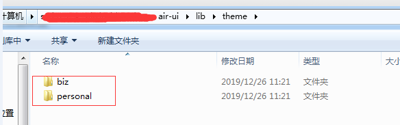
打完包之后,可以看到在 lib 目录有一个 theme 目录存放主题,打开之后,发现有两个主题目录,一个是 biz,一个是 personal:
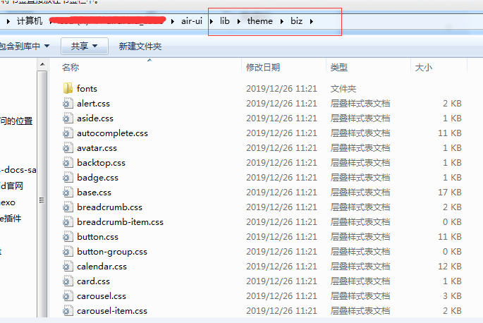
打开之后,就是这个主题的 css 文件,不仅有 index.scss,单独组件的样式也变成主题样式了:
使用新主题样式
如果要本次测试打包之后的,只需要把之前引用默认主题的路径改成新主题的路径即可:1
import '../lib/styles/index.css'
换成1
import '../lib/theme/biz/index.css'
这样子就行了。
如果是其他项目作为第三方依赖,换成这样子:1
2
3import AirUI from 'air-ui';
// import 'air-ui/lib/styles/index.css';
import 'air-ui/lib/theme/biz/index.css';
这样就可以应用新的主题了
总结
这样子属于 air-ui 的主题定制就完成了。事实上我们后面在进行企业版的主题定制的时候,还在原来 element-ui 定义的 var.scss 的基础上,将很多的组件的定制化做的更细了。 举一个我们现在做的一个企业版的主题的 biz.scss, src/theme/biz.scss:1
2
3
4
5
6
7
8
9
10
11
12
13
14
15
16
17
18
19
20
21
22
23
24
25
26
27
28
29
30
31
32
33
34
35
36
37
38
39
40
41
42
43
44
45
46
47
48
49
50
51
52
53
54
55
56
57
58
59
60
61
62
63
64
65
66
67
68
69
70
71
72
73
74
75
76
77
78
79
80
81
82
83
84
85
86
87
88
89
90
91
92
93
94
95
96
97
98
99
100
101
102
103
104
105
106
107
108
109
110
111
112
113
114
115
116
117
118
119
120
121
122
123
124
125
126
127
128
129
130
131
132
133
134
135
136
137
138
139
140
141
142
143
144
145
146
147
148
149
150
151
152
153
154
155
156/* 企业版公用主题色
-------------------------- */
$--color-primary: #008CEE !default;
$color-primary-lightter:#a0cfff;
$color-primary-light:#009dff;
/* Button 按钮组件变量
-------------------------- */
//按钮的默认padding air-button
$--button-padding-vertical:9px !default;
$--button-padding-horizontal:20px !default;
//air-button--mini
$--button-mini-padding-vertical:7px !default;
$--button-mini-padding-horizontal:15px !default;
//air-button--primary
$--button-primary-background-color:$--color-primary !default;
$--button-primary-border-color:$--color-primary !default;
$--button-hover-tint-percent:20% !default;//按钮hover时的透明度(说明:hover的样式是通过按钮的背景色和白色按比例计算的)
$--button-plain-background-percent:100% !default;//按钮 plain下的背景透明度
$--button-plain-border-percent: 0% !default;//按钮 plain下的边框透明度
$--button-plain-background-dis-percent:50%!default;//按钮 plain disable下的背景透明度
$--button-plain-border-dis-percent: 50% !default;//按钮 plain disable下的边框透明度
/* input 输入框组件变量
-------------------------- */
$--input-height: 36px !default;
$--input-line-height: 1.2 !default;
/// air-input-group__append background
$--input-group-append-background: #fff !default;
/// air-input-group__append text-align
$--input-group-append-text-align: center !default;
/* dialog 对话框组件变量
-------------------------- */
//air-dialog 样式配置 (margin、display、flex-direction、height、max-width、max-height)
$--dialog-margin-primary:0 !important !default;
$--dialog-display:flex !default;
$--dialog-flex-direction:column !default;
$--dialog-height:auto !default;
$--dialog-padding-primary: 20px 24px 25px !default;
$--dialog-max-width:calc(100vw - 40px) !default;
$--dialog-max-height:calc(100vh - 40px) !default;
$--dialog-body-padding:0 24px !default;
//air-dialog__body 样式配置(max-height、overflow-x、overflow-y)
$--dialog-body-max-height:calc(100vh - 200px) !default;
$--dialog-body-overflow-x:hidden !default;
$--dialog-body-overflow-y:auto !default;
//air-dialog__wrapper 遮罩样式配置(display、justify-content、align-items)
$--dialog-wrapper-display:flex !default;
$--dialog-wrapper-justify-content:center !default;
$--dialog-wrapper-align-items:center !default;
//air-dialog__footer 样式配置(padding)
$--dialog-footer-padding:24px !default;
///air-dialog__body &:last-child padding
$--dialog-body-last-child-padding:20px !default;
/* MessageBox弹窗 输入框组件变量
-------------------------- */
$--msgbox-width: 600px !default;
$--msgbox-padding-header:20px 24px 25px !default;
// messagebox的padding
$--messagebox-padding-bottom:0px !default;
// messagebox(带输入框的) padding-top
$--messagebox-input-padding-bottom:0px !default;
//air-message-box__btns 样式配置(padding)
$--messagebox-btns-padding:24px !default;
//air-message-box_content
$--messagebox-content-padding:0 24px !default;
/* Notification 通知
-------------------------- */
///air-notification__title
$--notification-title-margin:0 0 10px 0 !default;
///air-notification__title empty
$--notification-title-empty-margin-bottom:10px !default;
///air-notification__content
$--notification-content-margin:0 !default;
///air-notification__closeBtn top
$--notification-closeBtn-top:10px !default;
///air-notification__closeBtn right
$--notification-closeBtn-right:10px !default;
///air-notification air-button fontsize
$--notification-btn-fontsize:12px !default;
///air-notification air-button padding
$--notification-btn-padding:5px 15px !default;
/* Dropdown 下拉菜单
-------------------------- */
/// air-dropdown-menu max-height
$--dropdown-menu-max-height:400px !default;
/// air-dropdown-menu overflow-y
$--dropdown-menu-overflow-y:auto !default;
/// air-select-dropdown__list width
$--select-dropdown-list-width:99% !default;
/* NavMenu 导航菜单
-------------------------- */
$--menu-item-line-height: 50px !default;
$--menu-item-height: 50px !default;
/* air-range-xxx
--------------------------*/
$--range-input-vertical-align:middle !default;
$--range-separator-height:auto !default;
/* Form 表单
-------------------------- */
/// fontSize||Font|1
$--form-item-height: 36px !default;
$--form-item-margin-bottom: 20px !default;
///air-form-item__error line-height
$--form-item-error-line-height: 1.1 !default;
///air-form-item__error position
$--form-item-error-position: relative !default;
///air-form-item__error text-align
$--form-item-text-align: left !default;
/* Loading 加载
--------------------------*/
/// air-loading-mask
$--loading-mask-user-select: none !default;
/* Message 消息提示
-------------------------- */
$--message-min-width: 200px !default;
$--message-icon-font-size: 14px !default;
/// air-pagination__editor
$--pagination-editor-padding: 0 !default;
/// air-pagination__editor margin
$--pagination-editor-margin: 0 10px !default;
// air-pagination margin-top
$--pagination-margin-top: 15px !default;
/// air-pagination float
$--pagination-float: right !default;
/// air-pagination padding
$--pagination-padding: 0 !default;
/// air-pagination min-height
$--pagination-min-height: 30px !default;
/// air-pagination__jump margin-left
$--pagination-jump-margin-left: 20px !default;
/// air-pagination vertical-align
$--pagination-vertical-align: middle !default;
$--pagination-btn-vertical-align:middle !default;
/* Tree 树形控件
-------------------------- */
/// air-tree-node__content height
$--tree-node-content-height:30px !default;
/// air-tree-node__label overflow
$--tree-node-label-overflow:hidden !default;
/// air-tree-node__label text-overflow
$--tree-node-label-text-overflow:ellipsis !default;
/// air-tree-node__label white-space
$--tree-node-label-white-space:nowrap !default;
/// air-tree__empty-block min-height
$--tree-node-empty-block-min-height:30px !default;
这个定制化程度比之前更细了。 在原先的 var.scss 里面就增加了很多我们后面加上去的更详细的定制:1
2
3
4
5
6
7
8
9
10
11
12
13
14
15
16
17
18
19
20
21
22
23
24
25
26
27
28
29
30
31
32
33
34
35
36
37
38
39
40
41
42
43
44
45// messagebox的padding-bottom
$--messagebox-padding-bottom:10px !default;
// messagebox(带输入框的) padding-top
$--messagebox-input-padding-bottom:15px !default;
//air-message-box__btns 样式配置(padding)
$--messagebox-btns-padding:5px 15px 0 !default;
//air-message-box_content
$--messagebox-content-padding:10px $--msgbox-padding-primary !default;
///air-notification__title
$--notification-title-margin:0 !default;
///air-notification__title empty
$--notification-title-empty-margin-bottom:0 !default;
///air-notification__content
$--notification-content-margin:6px 0 0 0!default;
///air-notification__closeBtn top
$--notification-closeBtn-top:18px !default;
///air-notification__closeBtn right
$--notification-closeBtn-right:15px !default;
///air-notification air-button fontsize
$--notification-btn-fontsize:initial !default;
///air-notification air-button padding
$--notification-btn-padding:initial !default;
//air-dialog__wrapper 遮罩样式配置(display、justify-content、align-items)
$--dialog-wrapper-display:inherit !default;
$--dialog-wrapper-justify-content:initial !default;
$--dialog-wrapper-align-items:initial !default;
//air-dialog 样式配置 (margin、display、flex-direction、height、max-width、max-height、padding)
$--dialog-margin-primary: 0 auto 50px !default;
$--dialog-display:inherit !default;
$--dialog-flex-direction:initial !default;
$--dialog-height:initial !default;
$--dialog-max-width:initial !default;
$--dialog-max-height:initial !default;
$--dialog-body-padding:($--dialog-padding-primary + 10px) $--dialog-padding-primary !default;
//air-dialog__body 样式配置(max-height、overflow-x、overflow-y)
$--dialog-body-max-height:initial !default;
$--dialog-body-overflow-x:initial !default;
$--dialog-body-overflow-y:initial !default;
///air-dialog__footer 样式配置(padding)
$--dialog-footer-padding:10px $--dialog-padding-primary $--dialog-padding-primary !default;
///air-dialog__body &:last-child padding-bottom
$--dialog-body-last-child-padding:initial !default;
其实改了很多,以上这一部分都是我们后面对 var.scss 里面的组件进行颗粒度更细的定制。而这种方式,很显然,element-ui 是满足不了的,应该说第三方的 ui 框应该都满足不了,只有自己做的 ui 库才行。
下节我们讲一下怎么打包 pub 任务。以及为啥需要 pub 任务。
系列文章:
自建vue组件 air-ui (1) -- 为啥我要自建一个类 element ui 的组件
自建vue组件 air-ui (2) -- 先分析一下 element ui 项目
自建vue组件 air-ui (3) -- css 开发规范
自建vue组件 air-ui (4) -- air-ui 环境搭建和目录结构
自建vue组件 air-ui (5) -- 创建第一个组件 Button
自建vue组件 air-ui (6) -- 创建内置服务组件
自建vue组件 air-ui (7) -- 创建指令组件
自建vue组件 air-ui (8) -- 实现部分引入组件
自建vue组件 air-ui (9) -- 用 vuepress 写文档
自建vue组件 air-ui (10) -- vuepress 写文档 (进阶版)
自建vue组件 air-ui (11) -- vuepress 写文档 (爬坑版)
自建vue组件 air-ui (12) -- 国际化机制
自建vue组件 air-ui (13) -- 国际化机制(进阶版)
自建vue组件 air-ui (14) -- 打包构建(dev 和 dist)
自建vue组件 air-ui (15) -- 主题定制
自建vue组件 air-ui (16) -- 打包构建 pub 任务
自建vue组件 air-ui (17) -- 开发爬坑篇以及总结